Dark Theme Altair Charts
This tutorial shows how to create a Mercury web app with interactive, dark-themed Altair charts.
Altair is a great Python package for creating interactive visualizations. It works very well in notebooks, and with Mercury you can turn the notebook into a web app.
When your Mercury app uses a dark style, it is good to make your charts dark too. A bright chart on a dark page can look out of place. With Altair, you can apply a dark theme and keep the whole app visually consistent.
What You Will Build
Section titled “What You Will Build”You will build a single-notebook Mercury app with:
- a dropdown to switch between three chart types,
- a checkbox to turn the dark theme on or off,
- interactive Altair charts,
- a clean dark style that works well in Mercury.
Prerequisites
Section titled “Prerequisites”Install the required packages:
pip install mercury altair vega_datasets pandas1. Import Packages
Section titled “1. Import Packages”Start with the imports:
import mercury as mrimport altair as altfrom vega_datasets import dataimport pandas as pdWe use:
mercuryfor widgets and turning the notebook into a web app,altairfor charts,vega_datasetsfor example datasets,pandasfor simple data preparation.
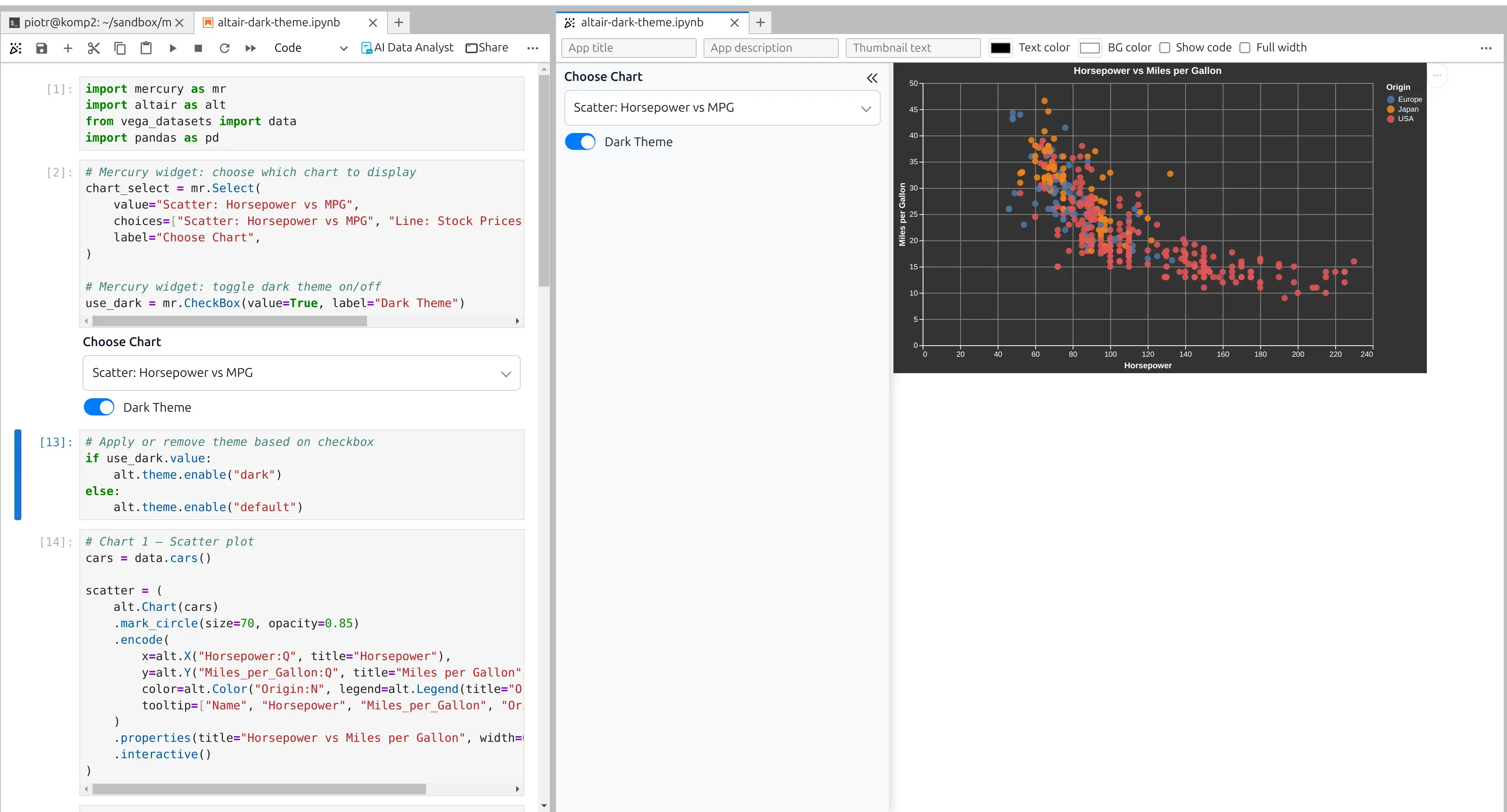
2. Add Mercury Widgets
Section titled “2. Add Mercury Widgets”Now add two Mercury widgets.
The first widget lets the user select which chart should be displayed.
The second widget lets the user turn the dark theme on or off.
# Mercury widget: choose which chart to displaychart_select = mr.Select(    value="Scatter: Horsepower vs MPG",    choices=["Scatter: Horsepower vs MPG", "Line: Stock Prices", "Bar: Seattle Precipitation"],    label="Choose Chart",)
# Mercury widget: toggle dark theme on/offuse_dark = mr.CheckBox(value=True, label="Dark Theme")
The mr.Select widget creates a dropdown.
The mr.CheckBox widget creates a checkbox.
When the user changes a widget, Mercury reruns the notebook and updates the output.
3. Apply or Remove the Dark Theme
Section titled “3. Apply or Remove the Dark Theme”Next, use the checkbox value to decide which Altair theme should be active.
# Apply or remove theme based on checkboxif use_dark.value: alt.theme.enable("dark")else: alt.theme.enable("default")When the checkbox is selected, Altair uses the dark theme.
When the checkbox is not selected, Altair uses the default theme.
This makes it easy to compare the dark and light chart styles directly in the Mercury app.
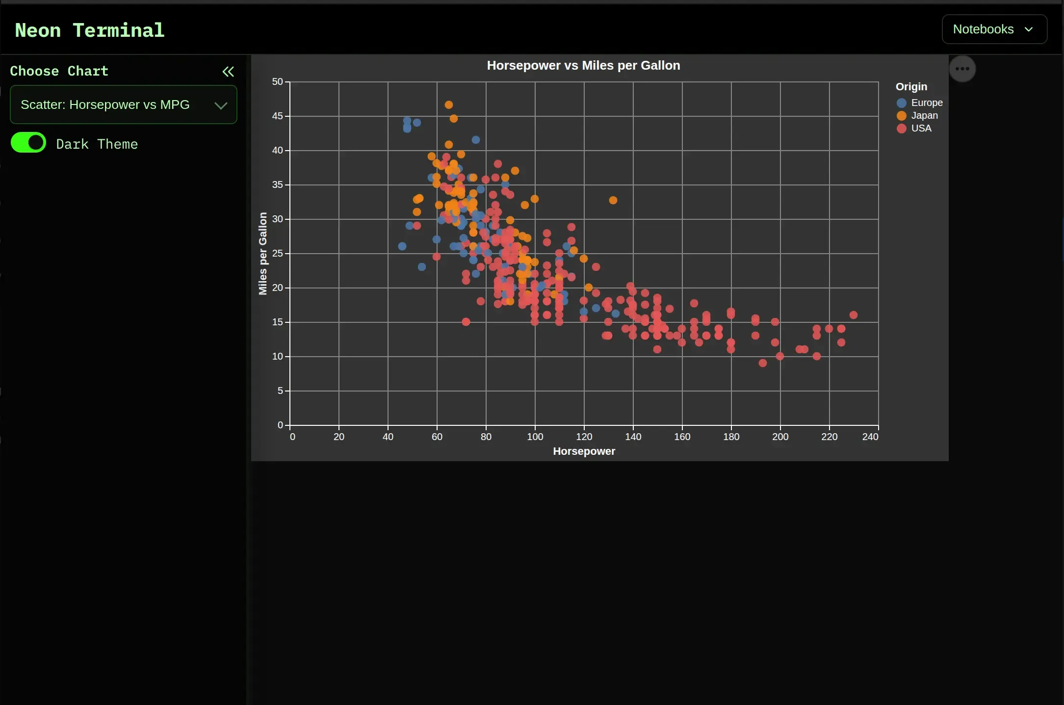
4. Create a Scatter Plot
Section titled “4. Create a Scatter Plot”The first chart shows the relationship between horsepower and miles per gallon.
# Chart 1 — Scatter plotcars = data.cars()
scatter = (    alt.Chart(cars)    .mark_circle(size=70, opacity=0.85)    .encode(        x=alt.X("Horsepower:Q", title="Horsepower"),        y=alt.Y("Miles_per_Gallon:Q", title="Miles per Gallon"),        color=alt.Color("Origin:N", legend=alt.Legend(title="Origin")),        tooltip=["Name", "Horsepower", "Miles_per_Gallon", "Origin"],    )    .properties(title="Horsepower vs Miles per Gallon", width=600, height=350)    .interactive())
This chart is interactive. You can zoom and move around the plot.
The tooltip shows more information when the user moves the mouse over a point.
5. Create a Line Chart
Section titled “5. Create a Line Chart”The second chart shows stock prices over time.
# Chart 2 — Multi-line stock chartstocks = data.stocks()
line = (    alt.Chart(stocks)    .mark_line(strokeWidth=2)    .encode(        x=alt.X("date:T", title="Date"),        y=alt.Y("price:Q", title="Price (USD)"),        color=alt.Color("symbol:N", legend=alt.Legend(title="Stock")),        tooltip=["symbol", "date", "price"],    )    .properties(title="Stock Prices Over Time", width=600, height=350)    .interactive())
The line chart is also interactive. It is useful for exploring time series data.
6. Create a Bar Chart
Section titled “6. Create a Bar Chart”The third chart shows average monthly precipitation in Seattle.
First, load the weather dataset and prepare the month column:
# Chart 3 — Bar chart of monthly precipitationseattle = data.seattle_weather()seattle["month"] = pd.to_datetime(seattle["date"]).dt.strftime("%b")month_order = ["Jan", "Feb", "Mar", "Apr", "May", "Jun", "Jul", "Aug", "Sep", "Oct", "Nov", "Dec"]monthly_precip = seattle.groupby("month", as_index=False)["precipitation"].mean()Then create the bar chart:
bar = ( alt.Chart(monthly_precip) .mark_bar(cornerRadiusTopLeft=3, cornerRadiusTopRight=3) .encode( x=alt.X("month:N", sort=month_order, title="Month"), y=alt.Y("precipitation:Q", title="Avg Precipitation (mm)"), color=alt.Color( "precipitation:Q", scale=alt.Scale(scheme="blues"), legend=None, ), tooltip=["month", alt.Tooltip("precipitation:Q", format=".2f")], ) .properties(title="Seattle: Average Monthly Precipitation", width=600, height=350))The bar chart uses rounded top corners and a blue color scale.
Small styling details like this make the chart look more modern.
7. Display the Selected Chart
Section titled “7. Display the Selected Chart”Now create a dictionary with all charts.
The selected value from the dropdown decides which chart should be displayed.
# Display selected chartcharts = {    "Scatter: Horsepower vs MPG": scatter,    "Line: Stock Prices": line,    "Bar: Seattle Precipitation": bar,}
charts[chart_select.value]
That is all.
Mercury reruns the notebook when the user changes the dropdown or checkbox, so the app always displays the selected chart with the selected theme.
We can preview the web app in the Jupyter Lab or MLJAR Studio:
8. Run the App
Section titled “8. Run the App”Save the notebook as:
altair-dark-theme.ipynbThen run it with Mercury:
mercury altair-dark-theme.ipynbOpen the app in your browser.
You will see the Mercury widgets in the sidebar and the selected Altair chart in the main area.
Why Dark Charts Look Good in Mercury
Section titled “Why Dark Charts Look Good in Mercury”Dark charts are useful when the rest of the app also uses a dark style.
They make the app look more consistent and polished.
This is useful for:
- dashboards,
- reports,
- monitoring apps,
- machine learning demos,
- internal tools,
- presentations.
The best part is that you do not need complicated code. You can keep your notebook simple and still create a nice web app.
Summary
Section titled “Summary”In this tutorial, you created a Mercury app with interactive Altair charts.
You learned how to:
- add Mercury widgets,
- switch between different charts,
- toggle the Altair theme,
- create scatter, line, and bar charts,
- display the selected chart in a Mercury web app.
Altair gives you interactive charts, and Mercury turns your notebook into a web app.
Together, they make it easy to build beautiful data apps directly from Python notebooks.