Build a dashboard with Vega-Altair and Python
The Vega-Altair (opens in a new tab) is a great package for building interactive visualizations. This tutorial shows how to use it in Jupyter Notebook. Moreover, thanks to the Mercury framework, we will publish Python notebook as a web application.
Here is a preview of the notebook and the dashboard:
Import packages
We will need the following packages:
mercury
altair
vega_datasetsmercurywill be used to create interactive widgets and publish the notebook as a web app,altairis a plotting package,vega_datasetsis a package with example datasets.
The import cell code:
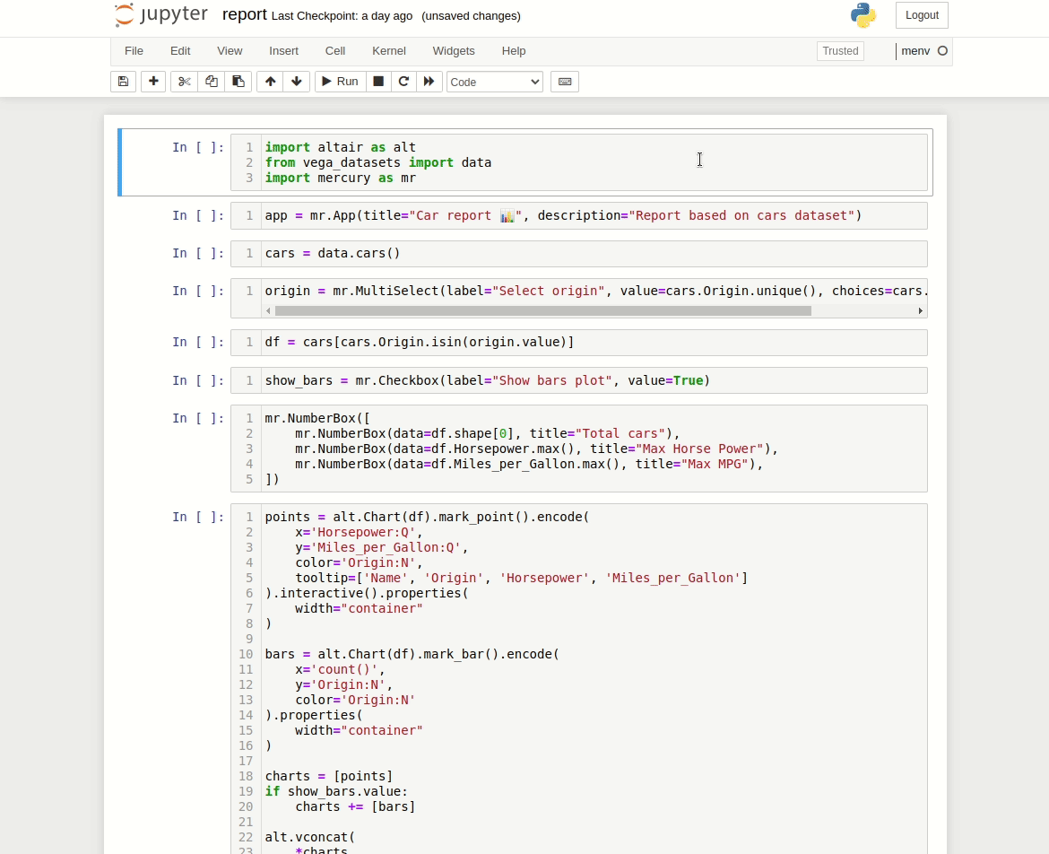
import altair as alt
from vega_datasets import data
import mercury as mr
Setup app properties
In the next cell, we will setup App properties:
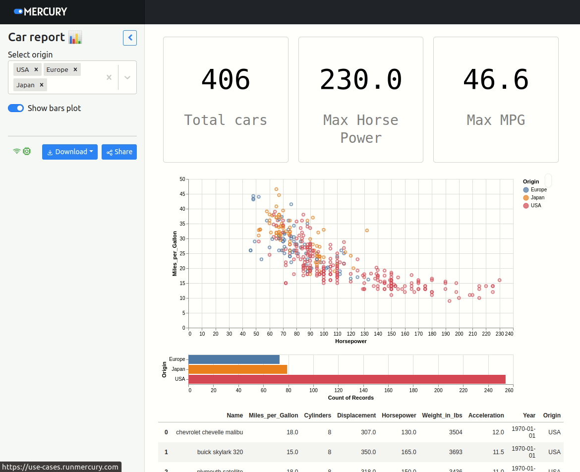
app = mr.App(title="Car report 📊", description="Report based on cars dataset")The title and description will be used for displaying information about the app in the home view (when served with Mercury):
Load data
We will use the cars dataset from the vega_datasets package:
cars = data.cars()Select samples based on widget selection
Let's add MultiSelect widget to choose origin of cars:
origin = mr.MultiSelect(label="Select origin", value=cars.Origin.unique(), choices=cars.Origin.unique())We will use selection .value to filter the Data Frame:
df = cars[cars.Origin.isin(origin.value)]Checkbox to control plots
We will add CheckBox to control number of plots:
show_bars = mr.Checkbox(label="Show bars plot", value=True)Display metrics
Metrics about data can be displayed with NumberBox widget:
mr.NumberBox([
    mr.NumberBox(data=df.shape[0], title="Total cars"),
    mr.NumberBox(data=df.Horsepower.max(), title="Max Horse Power"),
    mr.NumberBox(data=df.Miles_per_Gallon.max(), title="Max MPG"),
])
Create Vega-Altair plots
Please use the following code to create plots about cars data:
points = alt.Chart(df).mark_point().encode(
    x='Horsepower:Q',
    y='Miles_per_Gallon:Q',
    color='Origin:N',
    tooltip=['Name', 'Origin', 'Horsepower', 'Miles_per_Gallon']
).interactive().properties(
    width="container"
)

bars = alt.Chart(df).mark_bar().encode(
    x='count()',
    y='Origin:N',
    color='Origin:N'
).properties(
    width="container"
)

charts = [points]
if show_bars.value:
    charts += [bars]

alt.vconcat(
    *charts
).configure(autosize="fit-x")
Display Data Frame samples
Please call the head() function to display the first 20 samples from our data:
df.head(20)Here is the full code in the Jupyter Notebook:
Please notice that during notebook development, cells are not automatically re-executed after the widget update. You need to manually execute cells after the widget change in the Jupyter Notebook.
When serving the notebook with Mercury, cells are automatically re-executed after the widget change.
Run as a Web App
Please start Mercury Server with the following command:
mercury runYou should see the Web App running at the address http://127.0.0.1:8000. Below is an example demo:
Deployment
There are several ways to deploy apps created in the Mercury. The simplest way is to use Mercury Cloud (opens in a new tab). It is a hosting service where you can deploy notebooks as web apps with a few clicks. The app from the tutorial is available at this address use-cases.runmercury.com (opens in a new tab).
There are several options for self-hosting Mercury. Please check documentation for details.