Table
The Table widget displays data in a structured, interactive tabular format. It supports column sorting (ascending/descending), quick filtering, and row selection for easier data exploration.
Import
Section titled “Import”from mercury import TableTo use the Table widget, you only need to provide data. It works best with DataFrames (pandas or polars), but you can also pass lists of dict or dicts.
Example data
import pandas as pd
countries = ["Poland", "Germany", "France"]
df = pd.DataFrame({  "Country": [countries[i % 3] for i in range(100)],  "Year": [2020 + (i % 10) for i in range(100)],  "GDP": [500 + (i * 25) for i in range(100)],})
Code
t = Table(df)Preview
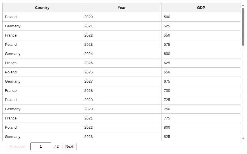
Table with features
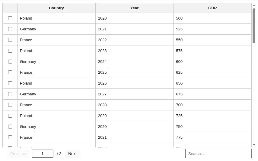
Section titled “Table with features”You can easily add more features to your table, such as row selection or filtering.
Code
t = Table(df, search=True, select_rows=True)Preview
Get selected rows
Section titled “Get selected rows”After enabling row selection, you may want to access all selected rows in one place — this is very easy to do.
Code
# t is the variable that you assign the Table tot.selected_rowsCustomize your Table
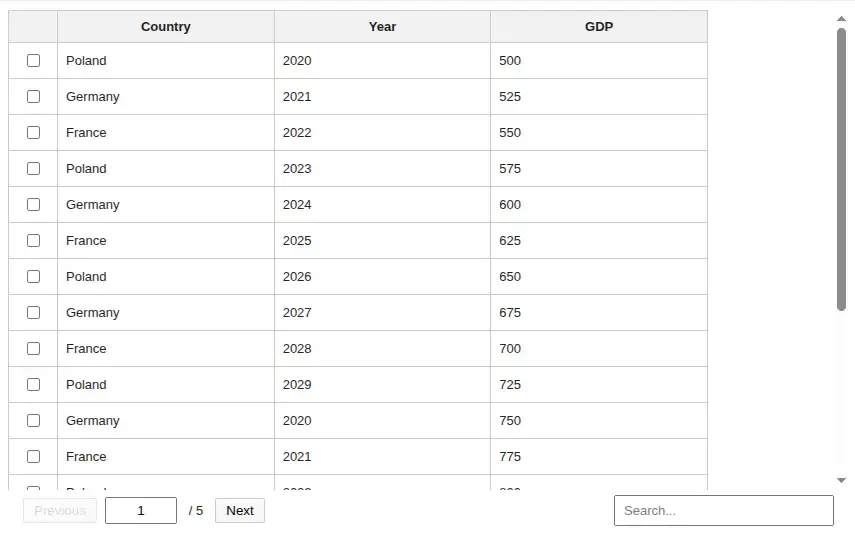
Section titled “Customize your Table”You can also customize the Table’s appearance by changing the page size (number of rows per page), width, or height.
Code
t = Table( df, search=True, select_rows=True, page_size=20, width="700px", height="360px",)Preview
Create without immediate display
Section titled “Create without immediate display”By default, Table() displays the widget immediately. Set display_now=False
when you want to create the widget first and display it later.
Code
from IPython.display import display
t = Table(df, display_now=False)
# display laterdisplay(t)
Table Props
Section titled “Table Props”data (required)
Section titled “data (required)”type: DataFrame or list[dict] or dict
The dataset displayed in the table. Accepts pandas/polars DataFrames or standard Python structures like lists of dictionaries.
page_size
Section titled “page_size”type: Integer
Sets how many rows are shown on a single page. Default is 50.
select_rows
Section titled “select_rows”type: boolean
Enables selecting rows in the table. It’s off by default (False).
search
Section titled “search”type: boolean
Enables the search bar and allows filtering table. It’s off by default (False).
type: string
Sets the width of the table component. Accepts CSS size values like 100%, 800px, 50vw, or 48rem.
Default is 100%.
height
Section titled “height”type: string | None
Sets the height of the scrollable table body. Accepts CSS size values like 360px, 50vh, or 24rem.
When None, Mercury keeps the current automatic table height behavior. Default is None.
show_index_col
Section titled “show_index_col”type: boolean
Controls whether the original DataFrame index is displayed as a table column.
Default is False.
position
Section titled “position”type: "sidebar" | "inline" | "bottom"
Controls where the table is rendered in the Mercury layout.
Default is "inline".
display_now
Section titled “display_now”type: boolean
Controls whether the table is displayed immediately after construction.
Set to False when you want to return the widget and display it later yourself. Default is True.
type: string
Optional identifier used to distinguish tables with the same data and options. Use it when you intentionally want separate table widget instances for the same dataset.
- Table widgets are cached based on the input data content and constructor options.
display_nowis not part of the cache key. It only controls whether the widget is displayed immediately.- Use
keyto force separate table instances for the same data.