Vega-Altair Line Chart
Introduction
Vega-Altair package is a powerful tool for data visualization, particularly within Jupyter Notebooks. It has a wide range of charts and plots to explore and one of them is Line Chart. We've prepared several examples to demonstrate how Vega-Altair works:
- simple line chart
- line chart with
pandasdata - an interactive line chart
If you need any information about Vega-Altair check their docs: Vega-Altair Docs (opens in a new tab).
All of code examples are availabe as Jupyter Notebooks in our GitHub repositiory:
Line Chart
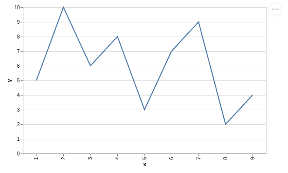
Visualization with only vega-altair package:
# import packages
import altair as alt

# create data
data = alt.Data(values=[{'x': 1, 'y': 5},
                        {'x': 2, 'y': 10},
                        {'x': 3, 'y': 6},
                        {'x': 4, 'y': 8},
                        {'x': 5, 'y': 3},
                        {'x': 6, 'y': 7},
                        {'x': 7, 'y': 9},
                        {'x': 8, 'y': 2},
                        {'x': 9, 'y': 4}])

# plot
alt.Chart(data).mark_line().encode(
    x = 'x:N',
    y = 'y:Q'
).properties(
    width=500
)
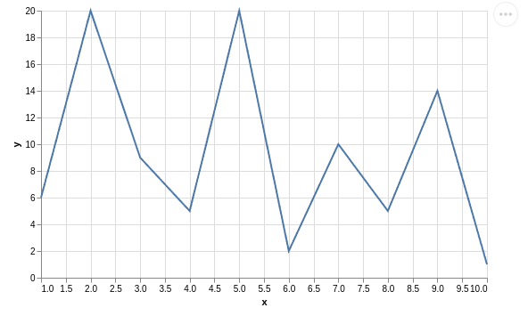
Line Chart with Pandas Data
Using vega-altair, create a line chart with pandas data:
# import packages
import altair as alt
import pandas as pd

# create data
df = pd.DataFrame({
    'x': [1,2,3,4,5,6,7,8,9,10],
    'y': [6,20,9,5,20,2,10,5,14,1]
})

# plot
alt.Chart(df).mark_line().encode(
    x = 'x',
    y = 'y'
).properties(
    width=500
)
Interactive Line Chart
Regular charts are not very exciting. What about creating an interactive line chart with vega-altair and mercury packages? You can decide if point will be visible using mercury widgets. In this example we used Checkbox (opens in a new tab).
# import packages
import altair as alt
import mercury as mr
import pandas as pd
# mercury widget
checkbox= mr.Checkbox(label="Points")# create data
df = pd.DataFrame({
'x': [1, 2, 3, 4, 5, 6, 7, 8, 9, 10, 11, 12, 13, 14, 15, 16, 17, 18, 19, 20],
'y': [9,22,7,4,17,10,28,15,20,26,27,16,28,27,11,12,25,29,27,9]
})
point=alt.OverlayMarkDef(color="red") if checkbox.value else False
# plot
alt.Chart(df).mark_line(
point=point
).encode(
x='x',
y='y'
).properties(
width=500
)Now, you can easily convert your Jupyter Notebook into a Web App! Watch the video to see what it will look like.
Deploying Web App is very easy that you can do it in 3 steps:
Login to Mercury Cloud
If you don't have account, you can create it here: Mercury Cloud (opens in a new tab).
Create new site
Create new or use an existing site.
Upload your notebook
Upload the notebook with code.
Congrats! You just created your own Web App and you can share your Jupyter Notebooks with nontechnical users. If you need more information about deploying the Web App check Mercury Cloud Documentation (opens in a new tab).