Seaborn Histogram Chart
Introduction
Seaborn is a tool used for creating visual charts, specifically designed to work smoothly with Jupyter Notebook. Among its offerings is the Histogram Chart, a commonly used visualization method. We've prepared some examples to illustrate how they appear and function for your reference.
- simple histogram chart
- histogram chart with
numpydata - histogram chart with
pandasdata - an interactive histogram chart
If you need any information about Seaborn check their docs: Seaborn Docs (opens in a new tab).
All of code examples are availabe as Jupyter Notebooks in our GitHub repositiory:
- Seaborn Histogram Chart (opens in a new tab)
- Seaborn Interactive Histogram Chart (opens in a new tab)
Histogram Chart
Example with just seaborn:
# import packages
import seaborn as sns

# create data
x = [0, 43, 45, 7, 23, 14, 27, 42, 29, 31, 17, 20, 47, 40, 41, 25, 3, 8, 8, 49]

# plot
_ = sns.histplot(x)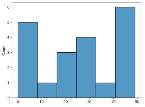
Histogram Chart with Numpy Data
Show numpy data as histogram chart using seaborn:
# import packages
import seaborn as sns
import numpy as np

# create data
x = np.array([17, 23, 5, 39, 38, 22, 27, 10, 9, 38, 14, 27, 26, 45, 27, 2, 2, 44, 31, 38])

# plot
_ = sns.histplot(x)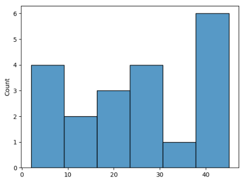
Histogram Chart with Pandas Data
Create a histogram chart using seaborn with pandas data:
# import packages
import seaborn as sns
import pandas as pd

# create data
df = pd.DataFrame({'value': [34, 22, 34, 13, 28, 8, 9, 18, 24, 19, 34, 21, 48, 48, 20, 10, 8, 7, 25, 2]})

# plot
_ = sns.histplot(df)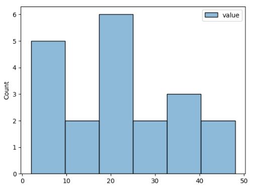
Interactive Histogram Chart
Static charts are boring. Let's create an interactive histogram chart using seaborn and mercury packages. You can modify the appearance of the chart conveniently with mercury widgets. In this example we used Checkbox (opens in a new tab).
# import packages
import seaborn as sns
import mercury as mr
# mercury widget
checkbox = mr.Checkbox(label="Filling")# create data
x = [49, 1, 33, 13, 46, 28, 1, 30, 48, 7, 8, 7, 34, 23, 39, 47, 9, 8, 12, 30]
fill = True if checkbox.value else False
# plot
_ = sns.histplot(x, fill=fill)Now, you can transform your Jupyter Notebook into a Web App effortlessly! Watch this video to see how it looks.
Deploying Web App is very easy that you can do it in 3 steps:
Login to Mercury Cloud
If you don't have account, you can create it here: Mercury Cloud (opens in a new tab).
Create new site
Create new or use an existing site.
Upload your notebook
Upload the notebook with code.
Congrats! You just created your own Web App and you can share your Jupyter Notebooks with nontechnical users. If you need more information about deploying the Web App check Mercury Cloud Documentation (opens in a new tab).