Plotly Line Chart
Plotly is a tool for creating charts, which works with Jupyter Notebook. Among its options is the Line Chart. We've got some examples ready to demonstrate their appearance and functionality, so you can see how they work.
- simple line chart
- line chart with
numpydata - line chart with
pandasdata - an interactive line chart
If you need any information about Plotly check their docs: Plotly Docs (opens in a new tab).
After plotly installation remember to restart your Jupyter before doing anything.
All of code examples are availabe as Jupyter Notebooks in our GitHub repositiory:
Line Chart
Example using only plotly package:
# import packages
import plotly.express as px

# create data
x = [3,20,15,3,18,10,6,18,19,3]

# plot
fig = px.line(x)
fig.show()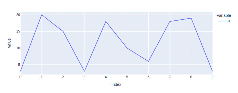
Line Chart with Numpy Data
Display numpy data as a line chart using plotly:
# import packages
import plotly.express as px
import numpy as np

# create data
x = np.array([12,20,15,18,16,12,3,10,3,20])

# plot
fig = px.line(x)
fig.show()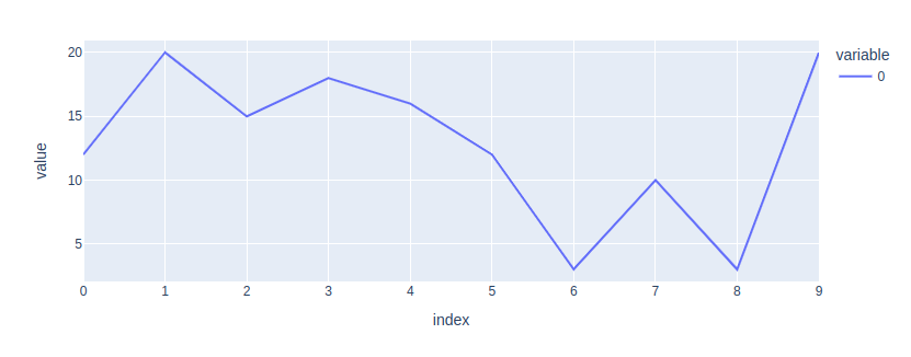
Line Chart with Pandas Data
Make a line chart with pandas data using plotly:
# import packages
import plotly.express as px
import pandas as pd

# create data
df = pd.DataFrame({'value': [10,5,15,19,7,13,13,4,2,8]})

# plot
fig = px.line(df)
fig.show()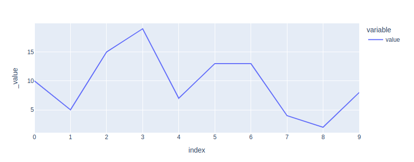
Interactive Line Chart
Ordinary charts are dull. Let's make an interactive line chart with plotly and mercury packages. You can choose which charts you want to display using mercury widgets. In this case, we're using MultiSelect (opens in a new tab).
# import packages
import plotly.express as px
import mercury as mr
import pandas as pd
# mercury widget
selection = mr.MultiSelect(value=["Line1"], choices=["Line1","Line2","Line3"], label="Choose plots")# create data
x1 = [20,18,11,19,7,19,10,17,2,17]
x2 = [12,10,15,10,4,7,8,11,8,16]
x3 = [13,11,1,18,6,15,6,10,18,20]
df = pd.DataFrame()
# plot
if "Line1" in selection.value:
df['line1'] = x1
if "Line2" in selection.value:
df['line2'] = x2
if "Line3" in selection.value:
df['line3'] = x3
fig = px.line(df)
fig.show()Now, you can easily turn your Jupyter Notebook into a Web App! Check out this video to see how it looks.
Deploying Web App is very easy that you can do it in 3 steps:
Login to Mercury Cloud
If you don't have account, you can create it here: Mercury Cloud (opens in a new tab).
Create new site
Create new or use an existing site.
Upload your notebook
Upload the notebook with code.
Congrats! You just created your own Web App and you can share your Jupyter Notebooks with nontechnical users. If you need more information about deploying the Web App check Mercury Cloud Documentation (opens in a new tab).