Matplotlib Bar Chart
Introduction
Matplotlib is a library for making charts, which works very well with Jupyter Notebook. One of them is called a Bar Chart. We've got a few examples ready to show you, so you can see what they look like and how they work.
- simple bar chart
- bar chart with
numpydata - bar chart with
pandasdata - an interactive bar chart
If you need any information about Matplotlib check their docs: Matplotlib Docs (opens in a new tab).
All of code examples are availabe as Jupyter Notebooks in our GitHub repositiory:
Bar Chart
Here is an example with using only matplotlib package:
# import packages
import matplotlib.pyplot as plt

# create data
x = [1,2,3,4,5]
y = [3.5,4.8,5.0,8.1,1.9]

# plot
plt.bar(x,y)
plt.show()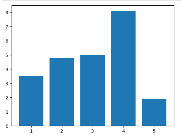
Bar Chart with Numpy Data
Display numpy data as bar chart using matplotlib library:
# import packages
import matplotlib.pyplot as plt
import numpy as np

# create data
x = 1 + np.arange(8)
y = np.array([4.8, 5.5, 3.5, 4.6, 6.5, 6.6, 2.6, 3.0])

# plot
plt.bar(x,y)
plt.show()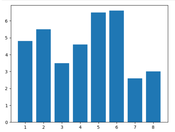
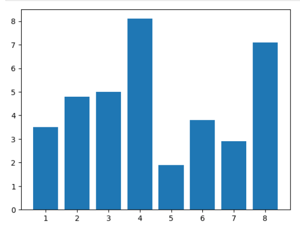
Bar Chart with Pandas Data
Turn pandas data into bar chart created with matplotlib:
# import packages
import matplotlib.pyplot as plt
import pandas as pd

# create data
df = pd.DataFrame(
    {
        "count": [1, 2, 3, 4, 5, 6, 7, 8],
        "value": [3.5, 4.8, 5.0, 8.1, 1.9, 3.8, 2.9, 7.1],
    }
)

# plot
plt.bar(df["count"], df["value"])
plt.show()
Interactive Bar Chart
Static charts are boring, what about creating an interactive bar chart? It's possible with matplotlib and mercury packages. You can modify data range with mercury widgets. In this example we used Slider (opens in a new tab):
# import packages
import matplotlib.pyplot as plt
import mercury as mr
# slider widget
slider= mr.Slider(value=5, min=3, max=8, label="How many bars?", step=1)# create data
all_x = [1,2,3,4,5,6,7,8]
all_y = [3.5,4.8,5.0,8.1,1.9,3.8,2.9,7.1]
x = all_x[0:slider.value]
y = all_y[0:slider.value]
# plot
plt.bar(x,y)
plt.show()Now, you can turn your Jupyter Notebook into Web App without additional code changes! Here is a video which presents how it will look:
Deploying Web App is very easy that you can do it in 3 steps:
Login to Mercury Cloud
If you don't have account, you can create it here: Mercury Cloud (opens in a new tab).
Create new site
Create new or use an existing site.
Upload your notebook
Upload the notebook with code.
Congrats! You just created your own Web App and you can share your Jupyter Notebooks with nontechnical users. If you need more information about deploying the Web App check Mercury Cloud Documentation (opens in a new tab).