Create Your First Sales Report in Python with Mercury
This page documents the exact notebook code from sales-report.ipynb.
The notebook is a report-style app (Markdown-first), with:
- inline filters (Region + Time granularity)
- computed KPIs
- an Altair line chart (Revenue over time)
- a short Conclusions section
App preview
Section titled “App preview”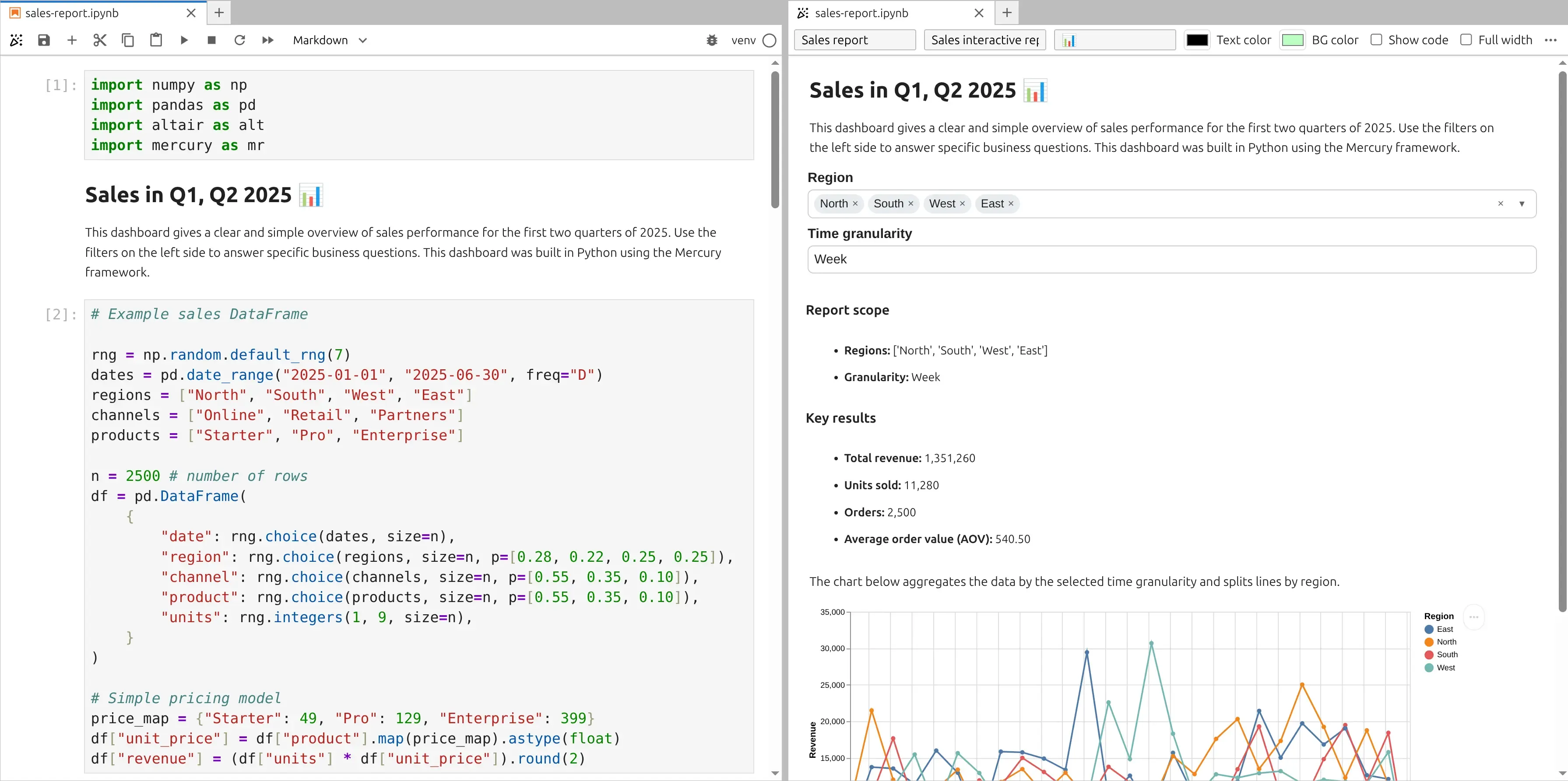
Try the live report:
1. Imports
Section titled “1. Imports”Your first cell imports exactly these packages:
import numpy as npimport pandas as pdimport altair as altimport mercury as mrmris used for widgets and rich Markdown sectionsaltairis used for the interactive chart
2. Report introduction (Markdown cell)
Section titled “2. Report introduction (Markdown cell)”Your notebook starts with a Markdown section that introduces the report:
## Sales in Q1, Q2 2025 📊
...
This is the key difference between reports and dashboards: the report is meant to be read top-to-bottom, like a document.
3. Generate example sales data
Section titled “3. Generate example sales data”Your dataset is generated with NumPy and stored in a pandas DataFrame.
# Example sales DataFrame
rng = np.random.default_rng(7)dates = pd.date_range("2025-01-01", "2025-06-30", freq="D")regions = ["North", "South", "West", "East"]channels = ["Online", "Retail", "Partners"]products = ["Starter", "Pro", "Enterprise"]
n = 2500 # number of rowsdf = pd.DataFrame(    {        "date": rng.choice(dates, size=n),        "region": rng.choice(regions, size=n, p=[0.28, 0.22, 0.25, 0.25]),        "channel": rng.choice(channels, size=n, p=[0.55, 0.35, 0.10]),        "product": rng.choice(products, size=n, p=[0.55, 0.35, 0.10]),        "units": rng.integers(1, 9, size=n),    })
# Simple pricing modelprice_map = {"Starter": 49, "Pro": 129, "Enterprise": 399}df["unit_price"] = df["product"].map(price_map).astype(float)df["revenue"] = (df["units"] * df["unit_price"]).round(2)
4. Inline filters (Region + Granularity)
Section titled “4. Inline filters (Region + Granularity)”In your notebook the widgets are created inline using position="inline":
region_sel = mr.MultiSelect(label="Region", choices=regions, value=regions, position="inline")granularity = mr.Select(label="Time granularity", choices=["Day", "Week", "Month"], value="Week", position="inline")These widgets control:
- which regions are included
- how time is aggregated in the chart
Related docs:
5. Filter the data
Section titled “5. Filter the data”Your filtering logic is intentionally minimal — the report filters only by region:
# filter datamask = (df["region"].isin(region_sel.value))dff = df.loc[mask].copy()6. Compute KPIs
Section titled “6. Compute KPIs”Next, the notebook calculates the core report metrics:
total_revenue = float(dff["revenue"].sum())total_units = int(dff["units"].sum())orders = int(len(dff))aov = (total_revenue / orders) if orders else 0.07. Dynamic report section with mr.Markdown(f"...")
Section titled “7. Dynamic report section with mr.Markdown(f"...")”This is the “report” part: you render a summary as Markdown, using live values from widgets and KPIs.
mr.Markdown(    f"""### Report scope
- **Regions:** {region_sel.value}- **Granularity:** {granularity.value}
### Key results
- **Total revenue:** {total_revenue:,.0f}- **Units sold:** {total_units:,.0f}- **Orders:** {orders:,.0f}- **Average order value (AOV):** {aov:,.2f}""")
Why it’s useful:
- you can keep the UI minimal
- the output reads like a human report
- numbers update automatically when filters change
8. Chart description (Markdown cell)
Section titled “8. Chart description (Markdown cell)”Before the chart, your notebook includes this Markdown explanation:
The chart below aggregates the data by the selected time granularity and splits lines by region.This keeps the report readable.
9. Build the Altair chart (time aggregation + revenue lines)
Section titled “9. Build the Altair chart (time aggregation + revenue lines)”Your chart code:
- derives
periodbased on the granularity widget - aggregates revenue/units
- plots revenue (fixed in this notebook)
dff["date"] = pd.to_datetime(dff["date"])
if granularity.value == "Day":    dff["period"] = dff["date"].dt.date.astype("datetime64[ns]")elif granularity.value == "Week":    dff["period"] = dff["date"].dt.to_period("W").dt.start_timeelse:  # Month    dff["period"] = dff["date"].dt.to_period("M").dt.start_time
agg = (    dff.groupby(["period", "region"], as_index=False)    .agg(revenue=("revenue", "sum"), units=("units", "sum"))    .sort_values("period"))
y_field = "revenue"y_title = "Revenue"
chart = (    alt.Chart(agg)    .mark_line(point=True)    .encode(        x=alt.X("period:T", title=""),        y=alt.Y(f"{y_field}:Q", title=y_title),        color=alt.Color("region:N", title="Region"),        tooltip=[            alt.Tooltip("period:T", title="Period"),            alt.Tooltip("region:N", title="Region"),            alt.Tooltip("revenue:Q", title="Revenue", format=",.2f"),            alt.Tooltip("units:Q", title="Units", format=",.0f"),        ],    )    .properties(height=320, width=700)    .interactive())
10. Render the chart
Section titled “10. Render the chart”Your notebook renders the chart by returning the variable:
chartMercury automatically displays it in the report flow.
11. Conclusions (Markdown cell)
Section titled “11. Conclusions (Markdown cell)”Your report ends with a conclusions section:
## Conclusions
Sales are very good
This is where you can add interpretation, notes, and next steps.