Create Your First Dashboard in Python (Step-by-Step Tutorial)
Dashboards are one of the most common use cases for Mercury web apps.
They allow you to combine filters, metrics, and charts into a single interactive view - all created directly from a Python notebook.
In this tutorial, you will build your first sales dashboard step by step. We will use Mercury widgets and Altair package for visualizations.
App preview
Section titled “App preview”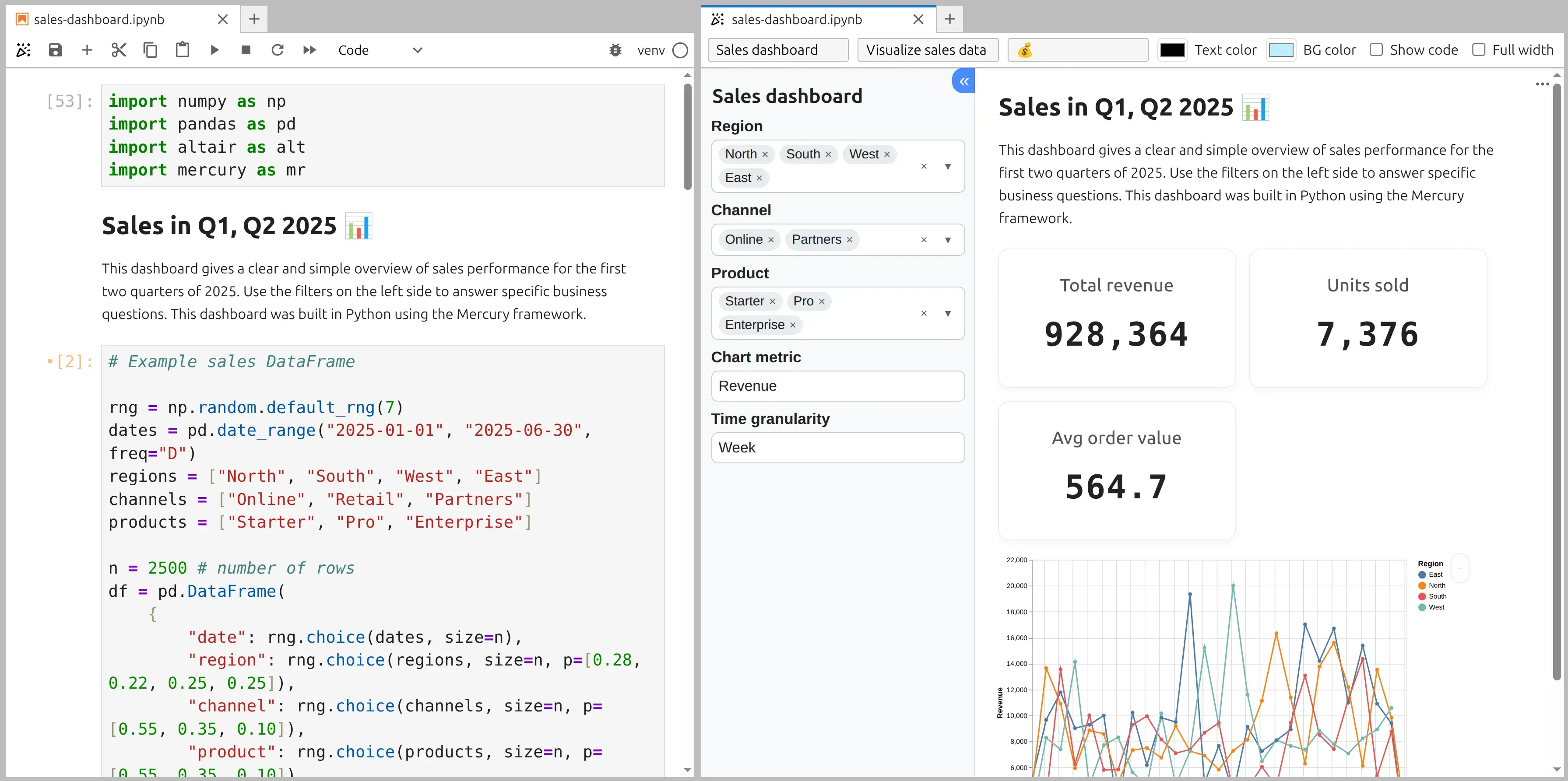
You can try the live dashboard:
1. Import Mercury and needed packages
Section titled “1. Import Mercury and needed packages”Start by importing Mercury and needed packages in the first notebook cell:
import numpy as npimport pandas as pdimport altair as altimport mercury as mrWe will use the mr alias to create all dashboard widgets.
The pandas and numpy packages are used for data generation and manipulation. The altair package is for visualization.
2. Prepare example data
Section titled “2. Prepare example data”In the next cell, prepare a simple sales dataset using pandas.
# Example sales DataFrame
rng = np.random.default_rng(7)dates = pd.date_range("2025-01-01", "2025-06-30", freq="D")regions = ["North", "South", "West", "East"]channels = ["Online", "Retail", "Partners"]products = ["Starter", "Pro", "Enterprise"]
n = 2500 # number of rowsdf = pd.DataFrame(    {        "date": rng.choice(dates, size=n),        "region": rng.choice(regions, size=n, p=[0.28, 0.22, 0.25, 0.25]),        "channel": rng.choice(channels, size=n, p=[0.55, 0.35, 0.10]),        "product": rng.choice(products, size=n, p=[0.55, 0.35, 0.10]),        "units": rng.integers(1, 9, size=n),    })
# Simple pricing modelprice_map = {"Starter": 49, "Pro": 129, "Enterprise": 399}df["unit_price"] = df["product"].map(price_map).astype(float)df["revenue"] = (df["units"] * df["unit_price"]).round(2)
This dataset represents sales revenue across multiple regions for three different plans.
3. Create dashboard filters
Section titled “3. Create dashboard filters”Dashboards usually start with filters. Here, we let the user select region, channel, product, metric and granularity.
region_sel = mr.MultiSelect(label="Region", choices=regions, value=regions)channel_sel = mr.MultiSelect(label="Channel", choices=channels, value=channels)product_sel = mr.MultiSelect(label="Product", choices=products, value=products)metric = mr.Select(label="Chart metric", choices=["Revenue", "Units"], value="Revenue")granularity = mr.Select(label="Time granularity", choices=["Day", "Week", "Month"], value="Week")The MultiSelect and Select widgets allows users to control what data is shown in the dashboard.
4. Filter the data
Section titled “4. Filter the data”Now filter the dataset based on values in widgets:
# filter datamask = ( (df["region"].isin(region_sel.value)) & (df["channel"].isin(channel_sel.value)) & (df["product"].isin(product_sel.value)))dff = df.loc[mask].copy()This filtered DataFrame will be reused across metrics and charts, keeping the dashboard consistent.
5. Display key metrics
Section titled “5. Display key metrics”Dashboards often show high-level numbers at the top.
total_revenue = float(dff["revenue"].sum())total_units = int(dff["units"].sum())orders = int(len(dff))aov = (total_revenue / orders) if orders else 0.0
mr.Indicator(    [        mr.Indicator(value=f"{total_revenue:,.0f}", label="Total revenue"),        mr.Indicator(value=f"{total_units:,.0f}", label="Units sold"),        mr.Indicator(value=round(aov, 2), label="Avg order value"),    ])
6. Create a chart
Section titled “6. Create a chart”Next, visualize the data using Altair.
dff["date"] = pd.to_datetime(dff["date"])
if granularity.value == "Day":    dff["period"] = dff["date"].dt.date.astype("datetime64[ns]")elif granularity.value == "Week":    dff["period"] = dff["date"].dt.to_period("W").dt.start_timeelse:  # Month    dff["period"] = dff["date"].dt.to_period("M").dt.start_time
agg = (    dff.groupby(["period", "region"], as_index=False)    .agg(revenue=("revenue", "sum"), units=("units", "sum"))    .sort_values("period"))
y_field = "revenue" if metric.value == "Revenue" else "units"y_title = "Revenue" if metric.value == "Revenue" else "Units"
chart = (    alt.Chart(agg)    .mark_line(point=True)    .encode(        x=alt.X("period:T", title=""),        y=alt.Y(f"{y_field}:Q", title=y_title),        color=alt.Color("region:N", title="Region"),        tooltip=[            alt.Tooltip("period:T", title="Period"),            alt.Tooltip("region:N", title="Region"),            alt.Tooltip("revenue:Q", title="Revenue", format=",.2f"),            alt.Tooltip("units:Q", title="Units", format=",.0f"),        ],    )    .properties(height=420, width=550)    .interactive())chart
Mercury automatically renders the chart as part of the dashboard output.
7. Why this works
Section titled “7. Why this works”- Mercury turns notebook cells into UI components
- Widgets (
MultiSelectandSelect) control the data flow - Metrics and charts update automatically
- No frontend code is required
- The notebook can be deployed as a web dashboard
Next steps
Section titled “Next steps”Once you are comfortable with the basics, you can:
- Add date pickers and sliders
- Use multiple charts
- Load data from CSV or databases
- Add authentication
- Deploy dashboards for your team
👍 You have just built your first interactive dashboard using Python and Mercury.